
Project Overview:
SuperGraphics, a sustainable B2B large format print company, has found great success through its traditional sales-focused model and commitment to client relationships. However, with the surge in online shopping, this sales-rep-driven model has failed to capture self-service customers seeking streamlined and efficient interior graphic solutions.
To address this challenge, I led the UX/UI design of an e-commerce web platform under the subsidiary brand, GreenScenes. GreenScenes’ primary goal is to offer sustainable, customizable, and quality interior graphic products and services to online shoppers through a user-friendly D2C e-commerce platform, helping SuperGraphics expand their market reach and stay competitive with the expanding online customer base.
My Role: UX/UI design, brand design, content strategy.
Client: SuperGraphics
Team: Myself, 2 stakeholders, 1 developer
Timeline: 5 months, 2023
Tools: Figma, Miro, Illustrator
Problem Statement: How might we empower self-service shoppers to easily discover and purchase sustainable, customizable interior graphic products and services?
1. Establishing Business Objectives
As GreenScenes is being built as a subsidiary business of SuperGraphics, a leading large-format printer, many core business elements have already been established. Because of this, our stakeholders initially envisioned the creation of GreenScenes as translating SuperGraphics into a D2C e-commerce platform under a new identity.
However, I emphasized to stakeholders that the creation of GreenScenes signifies a transition from a B2B, traditional sales-focused model to a D2C, e-commerce-oriented approach. I urged our team to determine a unified understanding of the new business, goals, and unique D2C audience. Ensuring this alignment from the get-go would empower me to design the best solutions to satisfy user goals and effectively capture customers.
Stakeholder Interviews
I organized interviews with key stakeholders to achieve a better understanding of their vision and expectations for the new company.
In these interviews, I asked stakeholders what they envisioned as an audience, what products they wanted to sell at launch and beyond, what services, and what they saw GreenScenes becoming in the years to come. This allowed me to establish a shared understanding of GreenScenes' specific business goals and target audience, providing a solid foundation for my design work.
To make sense of the information I learned, I synthesized my takeaways into an Affinity Diagram (pictured to the right).
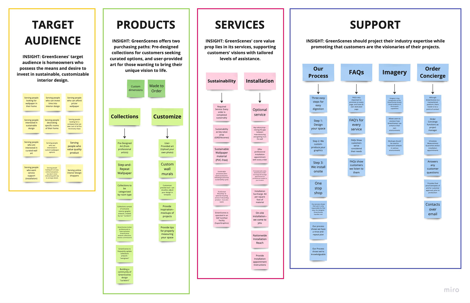
After synthesizing the Stakeholder's ideas, I extracted the following insights:
MADE FOR HOMEOWNERS: GreenScenes' target audience is homeowners who possess the means and desire to invest in interior design.
TWO USER JOURNEYS: GreenScenes offers a distinct user journey for two products: Pre-designed collections for customers seeking curated options, and user-provided art for those wanting to bring their unique vision to life.
SERVICE-CENTRIC VALUE PROPOSITION: GreenScenes' core value prop lies in its services, supporting customers' visions with tailored levels of assistance.
EMPOWER THE CUSTOMER’S VISION: Approach GreenScenes should project their industry expertise while promoting that customers are the visionaries of their projects.
Defining the Brand's Mission and Vision
Next, we used the insights from my stakeholder interviews to create succinct mission and vision statements for GreenSceens. As content heavily informs my design decisions, these were crucial for me to keep at the top of my mind as I designed the site.
Mission: Empowering individuals to design spaces that reflect their individuality and contribute to a better environment.
Vision: To revolutionize the interior design industry by providing accessible and sustainable graphic solutions that enrich the spaces where we live and work.
Brand Guide
Before building the e-commerce interface, I designed the visual identity for GreenScenees all the way from the brand naming to the logo design to the typography choices.
If you’re interested in learning more, my separate case study breaking down my GreenScenes brand guide is coming soon.

2. Research
Market Research
In the initial phase of my research, I aimed to pinpoint GreenScenes' target audience beyond the information provided by stakeholders. My goal was to understand the demographics and characteristics of individuals most likely to search for and purchase interior graphics online.
Here are the key insights I gathered:
People with a higher income are more likely to spend at GreenScenes. People with expendable income are more likely to allocate funds for such creative endeavors, as they can afford to invest in the aesthetics of their homes. Higher-income consumers are not only more likely to spend but also more likely to spend online, making this demographic the primary focus for GreenScenes. This is supported by data showing that consumers with incomes over $100,000 a year were the most likely to increase their overall spending quarter-over-quarter in 2023. Additionally, 54% of high-income consumers increased their online spending in Q3 2023. (source)
GreenScenes services may be of more interest to homeowners than renters. Not only are there more homeowners in the US as 66% of households own their home, they also statistically make more money. Based on a study by the Federal Reserve, the median net worth of homeowners in the United States is 40 times greater than that of renters (source). This suggests that homeowners are more likely to have an expendable income for GreenScenes' offerings.
Millennials are the most frequent home upgraders and online shoppers. Millennial homeowners are a significant segment of the target audience, as they are the most active in home upgrades and online shopping. A 2023 survey found 78% of millennial homeowners reported working on upgrades in the past year (source). Additionally, a 2023 study found that millennials are the most value-seeking and frequent online shoppers compared to Gen X and Baby Boomers, making them an ideal target audience for GreenScenes (source).
It is likely that people interested in GreenScenes have children. A 2023 survey revealed that 80% of homeowners with children had initiated or completed a home improvement project in the past year, while this percentage was 18% lower for homeowners without children (source).
Gender-Neutral Audience: Both men and women are potential customers for GreenScenes. Surveys indicate that 73% of men and 63% of women are involved in home improvement projects, suggesting a relatively even split between genders in this market. (source)
From this market research, I was able to identify that GreenScenes' target audience is higher-income, millennial homeowners living in family homes. This audience segment is most likely to have the financial means and motivation to invest in interior design and graphics through an online vendor.
Competitive Analysis
I analyzed top D2C wallpaper companies to understand how they structure their website and support users during the checkout process. By conducting a feature inventory and following their checkout processes, I gained insights that informed my design decisions and highlighted areas for improvement.
Here are the key takeaways from my competitor research:
1. Efficient Navigation
I observed that competitors prioritize user-friendly product navigation with clear categorization and intuitive filters. From this, I learned to streamline our categorization system and implement filtering options, aiming to reduce user search time and create an overall smoother and more efficient user experience.
2. Custom Product Dimensions
I found some competitors allow users to input custom product dimensions, empowering users to order the exact amount of material without the need for manual calculations. I've decided to implement this feature to enhance the user experience and reduce material waste.
3. User-friendly Product Visualizer
I found that with competitors providing product customization, where they can upload their own photo for their product, it was the most enjoyable process when there were various tools for the user’s success (product visualization, responsive frame, ability to move image, visualizing lengths of panels). Although I wasn’t sure of the limitations of achieving this with our developer, I wanted to adopt similar tools to provide as smooth of a customization process as possible.
4. Offering Inspiration
A common priority for competitors was providing inspiration for users, most of the time very easy to find at the top level. Whether this was case studies, Instagram feeds of related projects, or more information about themes, this seemed like a great tool to make the user feel supported in this purchasing decision and connected to the brand.
I also determined gaps where GreenScenes could differentiate from the competition:
Emphasis on Sustainability
I noted that many competitors underemphasize sustainability, despite a significant market of purpose-driven consumers. As a response, I decided to prominently feature sustainability initiatives across our website, as high as the top level of our information architecture. This positions us as a brand that champions sustainability, differentiating us in the market.
Value-Added Services
I uncovered a notable gap in the market—specifically, the absence of services (site survey, installation) for wallpaper products. As a result, I decided to differentiate ourselves by integrating professional services into our e-commerce process. This enhancement not only addresses the gap but also adds value to our customers by providing a comprehensive solution and a more convenient experience.
By incorporating these insights into the design and content strategy, I was able to better cater to the target audience and enhance the overall user experience.
User Persona Maps
To effectively design for our target GreenScenes’ users, I needed to understand who they are, what goals they are hoping to accomplish, and what they need to accomplish them. Utilizing the target audience I developed from my market research, I next built persona and empathy maps for our target D2C customers.

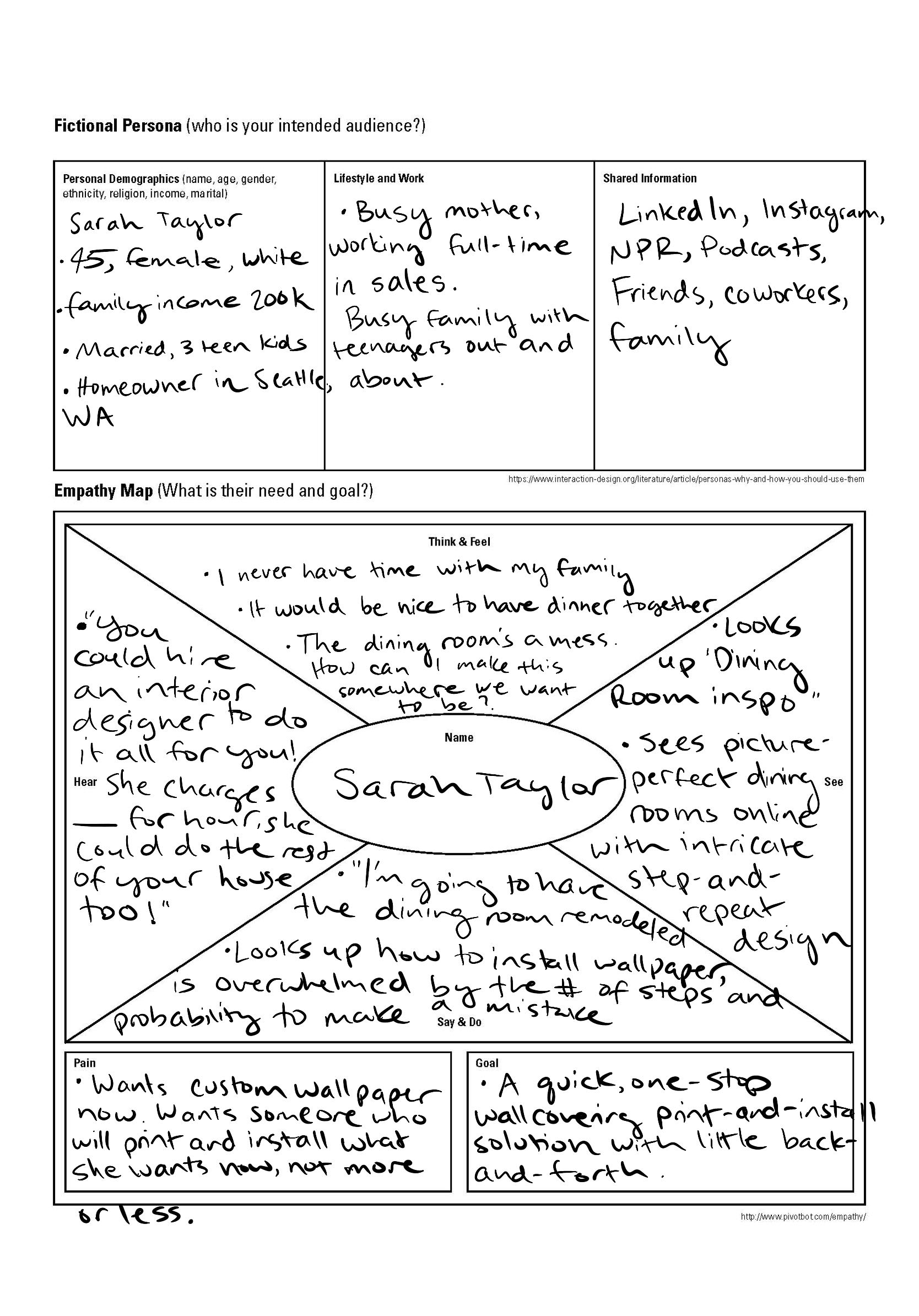
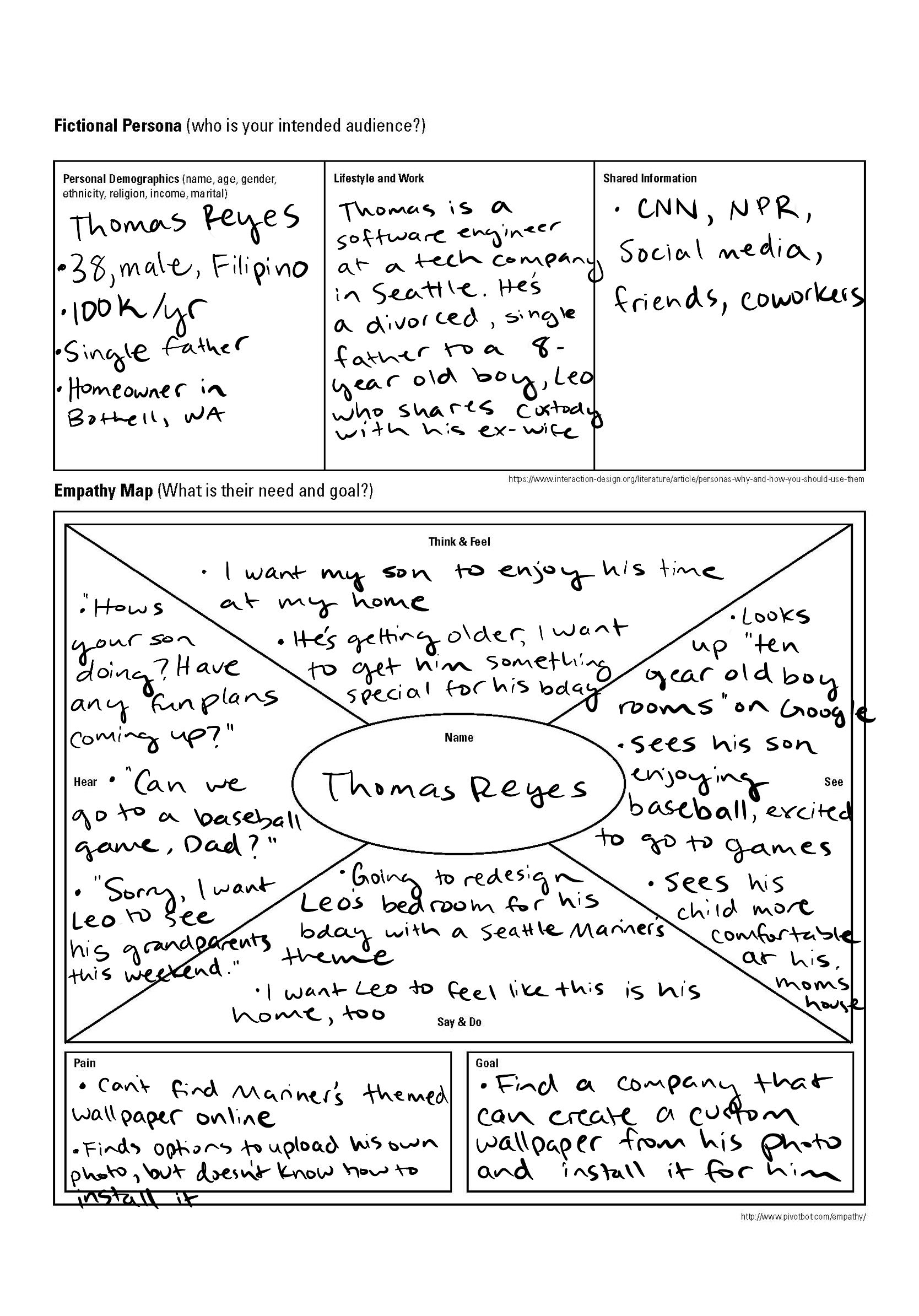
Next, I analyzed the motivations behind these user personas to pinpoint their core needs. This allowed me to distill these requirements into a succinct user goal and problem statement to guide my design process.
User Needs:
- Versatile design options
- Intuitive and efficient product discoverability
- High-quality products
- Sustainable graphic options
- Comprehensive one-stop shop
- Access to support services
- Quick project turnaround
- Confidence that their investment won’t go to waste
- Versatile design options
- Intuitive and efficient product discoverability
- High-quality products
- Sustainable graphic options
- Comprehensive one-stop shop
- Access to support services
- Quick project turnaround
- Confidence that their investment won’t go to waste
User Goal: To easily acquire sustainable, customizable interior graphic products and any desired support services from a single, convenient source.
Problem Statement: How might we empower self-service shoppers to easily discover and purchase sustainable, customizable interior graphic products and services?
3. Design
Information Architecture
Using all my research to this point, I organized a sitemap to show my intended hierarchy and navigation structure of the GreenScenes site. On the top level, I prioritized the Collections and Customization purchasing paths to guide users to the products. I also put sustainability on the top level as it is one of GreenScenes' key value propositions.
I organized Collections ‘by room’, as requested by my stakeholders, choosing the top rooms utilized by competitors. I also organized them by artist, as we planned to expand our group of exclusive artists providing artwork for GreenScenes.
However, when presenting this to my stakeholders, this resulted in the scope of the project changing.
Navigating Stakeholder Feedback
Upon the first review of my sitemap, the GreenScenes stakeholders saw the reach potential that an e-commerce platform could have. They requested to expand the scope of GreenScenes, including:
- Expanding our products to include window graphics and locker wraps
- Expanding our target audience to include commercial customers
- Expanding our optional services to include site surveys and samples
This led me to a new challenge of balancing between accommodating the stakeholder requests and prioritizing a user-centric approach. Through open discussion, I highlighted the potential consequences of these changes on our business's established mission, vision, and target audience. I stressed the importance of maintaining a user-centered design approach, cautioning that catering to too broad an audience might lead to reduced usability, increased complexity, and a poor overall user experience, which could lead to fewer conversions.
Next, I worked with stakeholders to find a middle ground on these additions. We determined what components aligned with the original mission and vision of GreenScenes, agreeing to cater to a broader audience but not at the expense of the core residential user experience.
Here are the changes to the business model we agreed upon:
We added window graphics to our product offerings while omitting locker wraps. This choice was driven by the alignment of window graphics with our core mission of serving interior graphics. To enhance the user experience, we decided to restructure Collections on the sitemap to include ‘by product’ categorization, allowing for product-specific sorting beyond wallpaper.
We introduced a collections filtering option tailored to corporate customers. Although we agreed that GreenScenes primary audience remain residential customers, we decided to provide a category of interior graphics on the sitemap that could serve a corporate setting. We agreed on this decision as it allowed GreenScenes to serve a broader audience, but not at the expense of the core user experience. To do so, I restructured Collections on the sitemap to include the sort option, 'for corporate,' complete with corporate room design options.
We expanded our optional services by including site surveys and samples. This decision was made based on the belief that it aligned with our mission of providing accessible graphic solutions. From a UX perspective, we expanded our approach by promoting a range of 'premium add-ons,' including the measurement guarantee and samples, in addition to promoting installation as an order add-on.
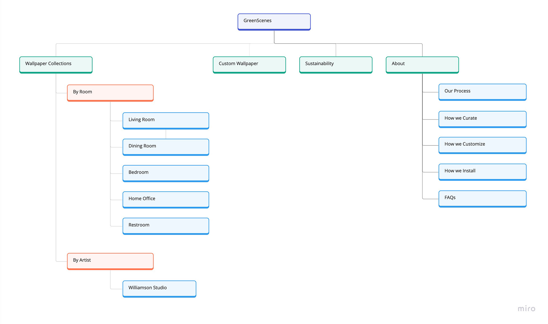
Revised Information Architecture
After multiple rounds of iterations and analysis on our competitors, we landed at a finalized sitemap.
I refined the top-level titles by removing the term "Wallpaper" from "Collections" and "Customize." Now that GreenScenes intends to offer more than wallpaper, this simplification ensures a more straightforward and user-friendly experience.
I significantly restructured "Collections." I introduced new submenus that categorize collections that address our expanded scope, including the submenus "By Product" and "For Corporate." This reorganization makes it easier for users to navigate and discover specific content.
I reduced the "For Home" and "For Corporate" menu options. To alleviate cognitive overload, I chose to present three options each. This reduction in choices ensures a more focused and less overwhelming user experience, making it easier for visitors to find what they're looking for.

User Journey Maps
To visualize the key user touchpoints of using the GreenScenes sites, I created two user journey maps—one following the route of selecting a design from collections, and the other route of uploading your own photo for a custom design.
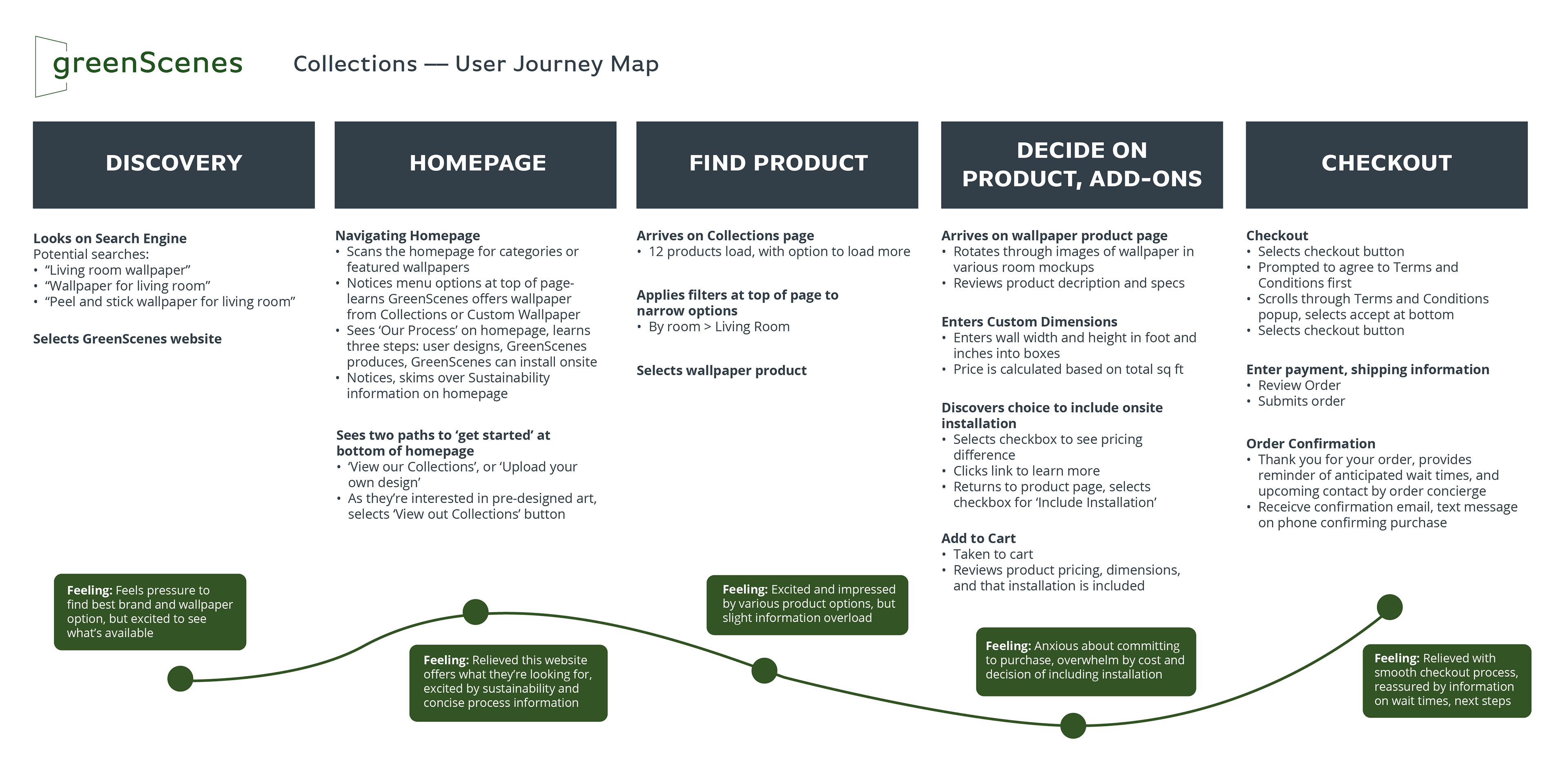
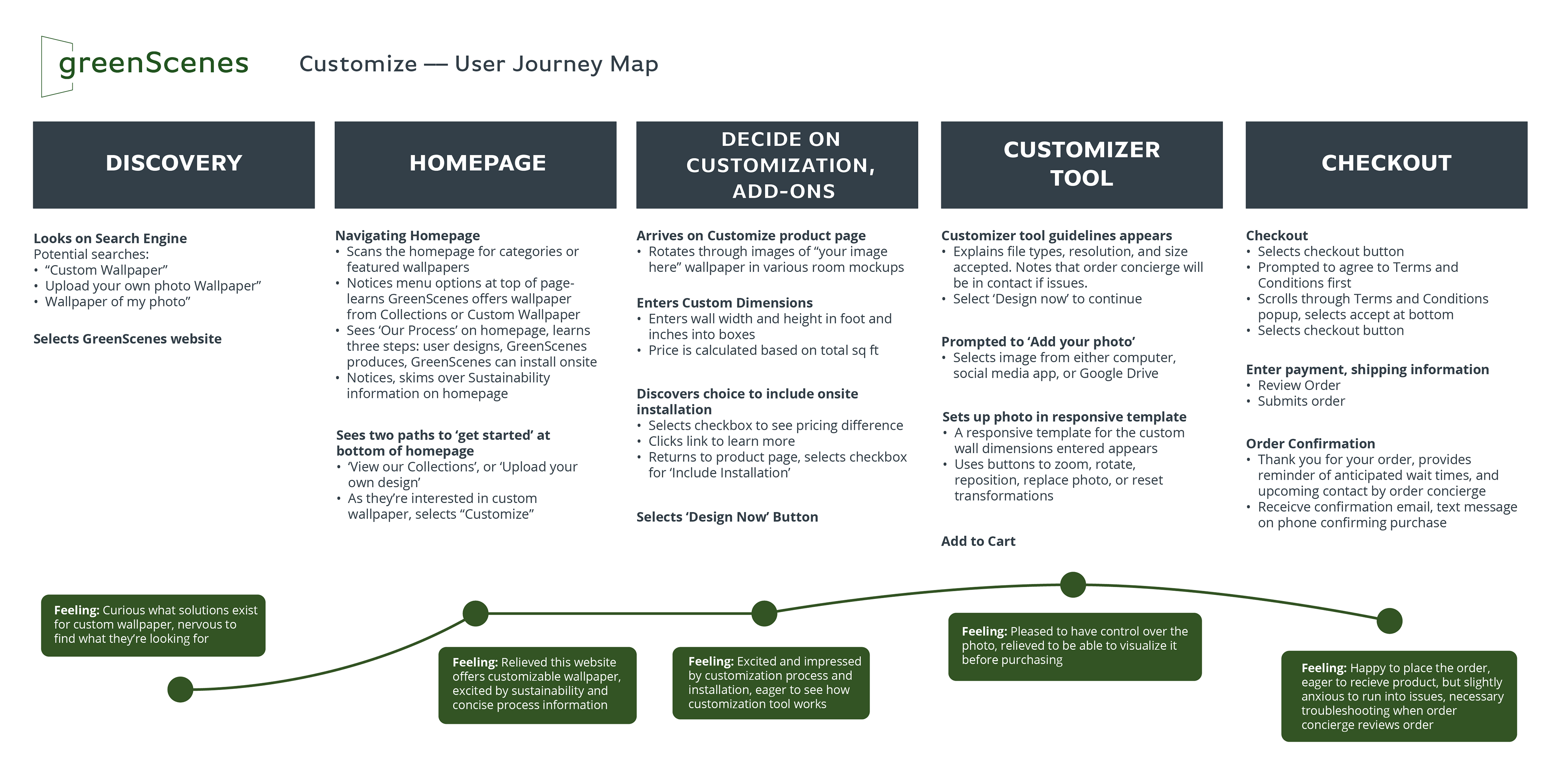
By visualizing the two distinct user paths and considering their emotions, motivations, and pain points at each step, I was better able to make design decisions that would ultimately lead to a more user-centric product.
Content Strategy
One of my responsibilities for this project was copywriting the content for each page. This required me to outline and execute GreenScenes' content strategy.
My Content Strategy looked like this:
Set Clear Objectives: I collaborated with stakeholders to define specific objectives for each page, ensuring content served its purpose in the user journey— whether to inform, support, engage, or drive conversions.
Establishing Keywords: Our team utilized SEMrush to analyze competitors' SEO and identify relevant keywords. We developed our own master list, targeting 1-2 keywords per page.
Determine and target KPI's: We identified specific key performance indicators to guide our strategic decisions from the outset.
To target subscription acquisition, I decided to create a dedicated landing page, place a form in the footer, and implement a fixed notification bar beneath the navigation. To target a high service adoption rate, I incorporated supporting information on both the product page and within a popup that appears when entering your product dimensions. To target conversions, we focused on streamlining the user journey for a brief and enjoyable experience.
Setting the Tone: Using my research insights, I shaped the narrative tone for the GreenScenes brand. My aim was for GreenScenes to convey a blend of expertise and approachability, fostering trust with clients as industry experts while highlighting their control over their projects.
Create Content Outline: Guided by the objectives and tone, I outlined the content elements for each page. I organized information in content blocks including headlines, subheadlines, and CTA’s. I aimed to convey three key points on each informational landing page, maintaining brevity and clarity.
Iterative Copywriting: Finally, I wrote the site's body copy. Employing an iterative approach, I consistently checked in with stakeholders to ensure comprehensive coverage of essential information.
This content strategy was the backbone of my design process, informing my design choices.
Sketching and Lo-Fi Wireframing
Following the content outline, I sketched various iterations to craft low-fidelity wireframes for key GreenScenes web pages. I primarily designed these for desktop as per the request of my stakeholders.
Keeping in mind that these designs were going to be built by our developer on Shopify, I aimed to ensure the designs were in alignment with the CMS e-commerce platform.
Homepage
To begin, I sketched and wireframed the most common user entry point: The homepage. I produced various arrangements of content blocks to brainstorm how I could accomplish two goals:
1. Explain what GreenScenes is, and
2. Direct users to either one of the two key purchasing paths: Collections or Customize.
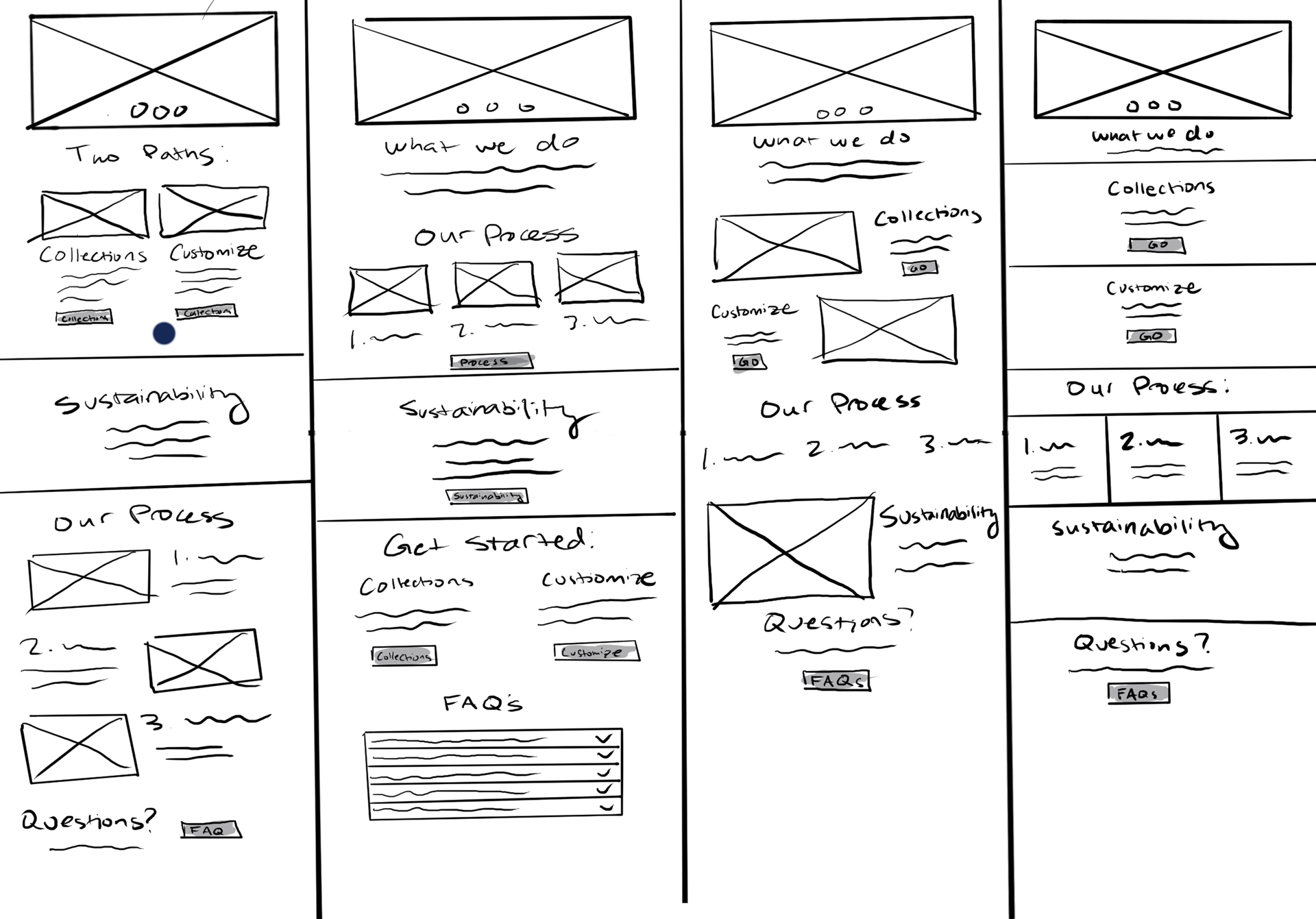
Homepage Brainstorming Sketches
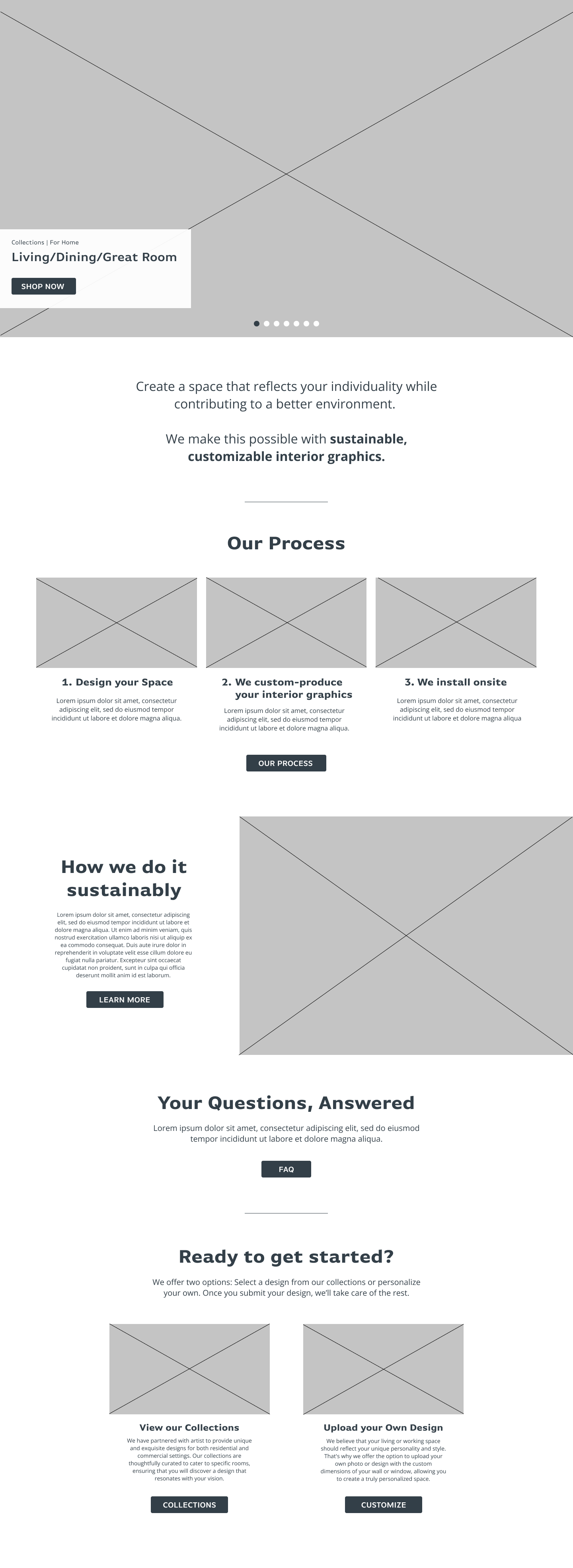
Homepage Lo-Fi Wireframe
Ultimately, I chose a narrative-first content organization, starting with an introduction to who we are, our processes, sustainability practices, FAQs, and concluding with the presentation of two purchasing paths. Here's the reasoning behind the narrative-first approach:
Clear Identity Establishment: It unmistakably communicates who GreenScenes is and what the company does.
User Engagement: By leading with a narrative, it engages users, drawing them into the mission and story of the company.
Brand Consistency: It aligns seamlessly with the brand's tone, ensuring GreenScenes conveys the expertise needed to transform the user's vision into reality.
Intuitive Conclusion: Placing the purchasing path CTAs at the end offers an intuitive conclusion, making them easily discoverable for users.
Collections Listing Page
When planning the design for the Collections listing page, I needed to create a design that creates four distinct product filtering options: By Artist, By Product, For Home, and For Corporate. To address this, I brainstormed three possible solutions:
1. Collections Directory Landing Page: This solution is a catch-all landing page that directs users to various product categories.
2. Unified Listing Page: Another idea was to consolidate all products on a single listing page, but empower the user's search process with filtering options.
3. Unique Category Landing Pages: Lastly, I considered having separate landing pages for specific product/filtering options.
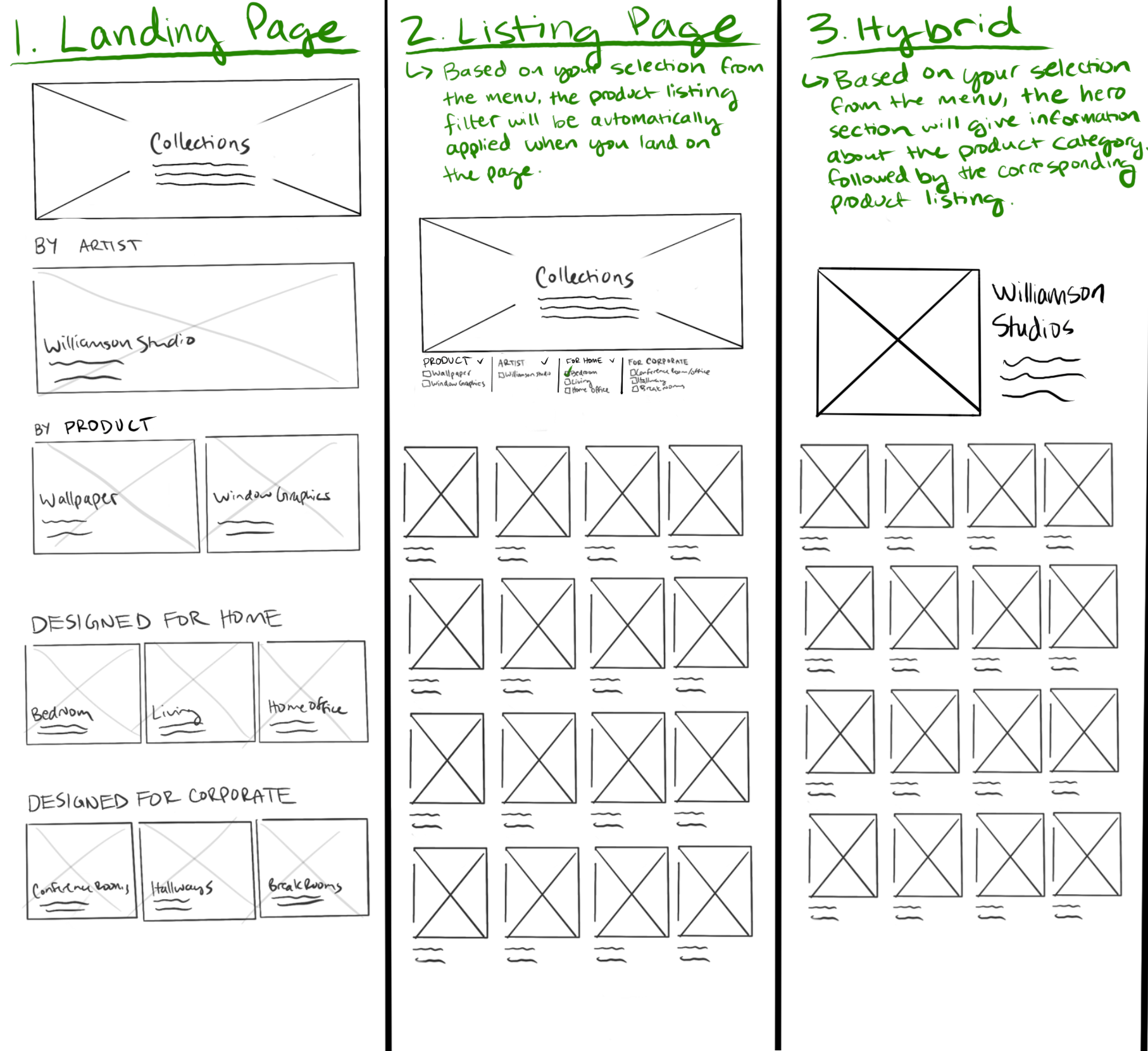
Collections Listing - Brainstorming Sketches

Collections Listing - Lo-Fi Wireframe
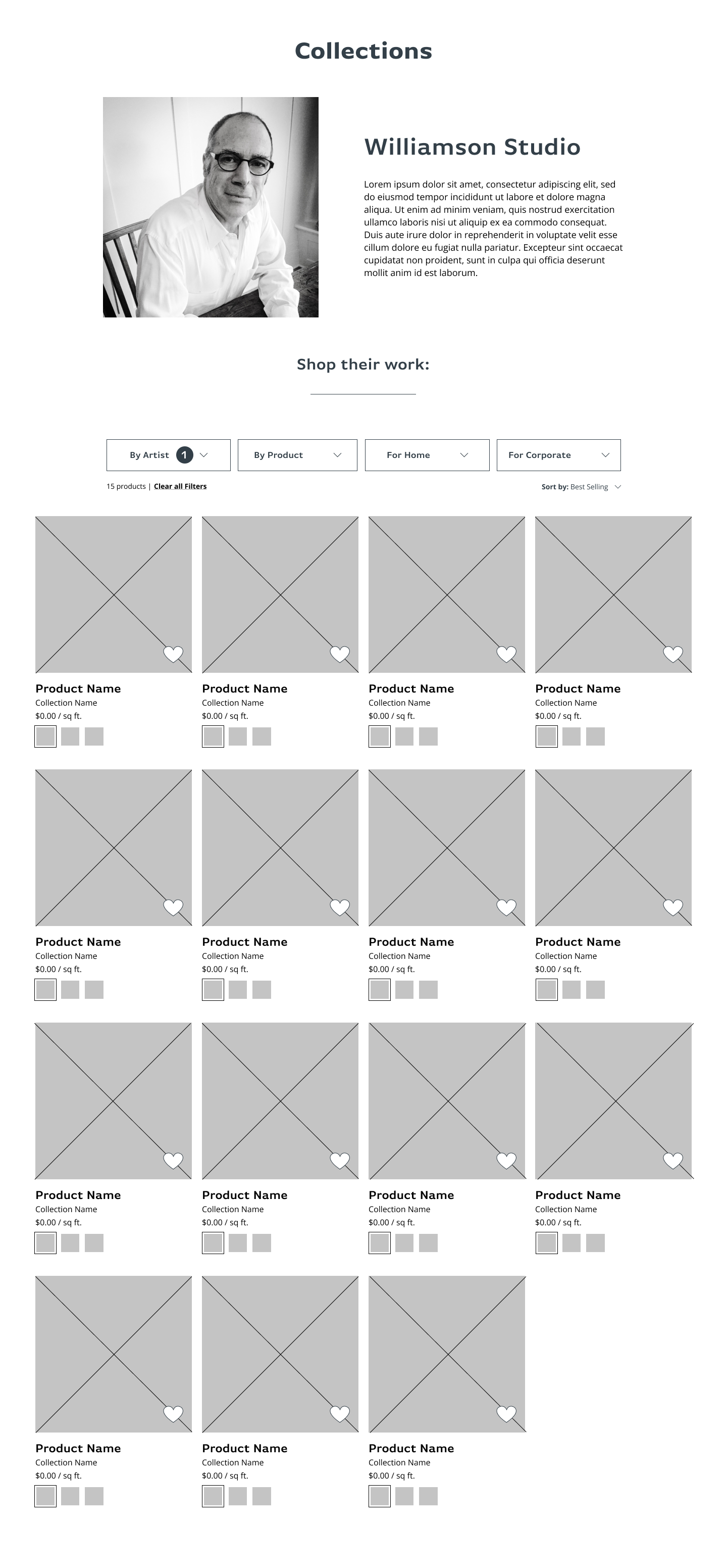
By Artist - Lo-Fi Wireframe
After testing out these solutions with our team, we found that the unified listing page with strong menu filtering options was the fastest way to get the user to the products they were looking for. This aligned with our market and competitor research that simple and intuitive navigation is important to driving conversions.
However, recognizing the importance of showcasing our artists, I took a distinctive approach to the "By Artist" filtering category. I designed a unique landing page for artists, placing an artist's informational spotlight before their product listing. This solution reflects our belief that understanding the artist adds a layer of personal connection, context, and value to their work—ultimately enhancing the potential for driving conversions.
Collections Listing Filtering
In my efforts to have Collections pages showcase products based on user menu selections, I devised a system for filtering products. Sketching out this design not only aided in effectively communicating my vision to the developer but also in determining the feasibility of implementing this idea (which fortunately, we were able to achieve).
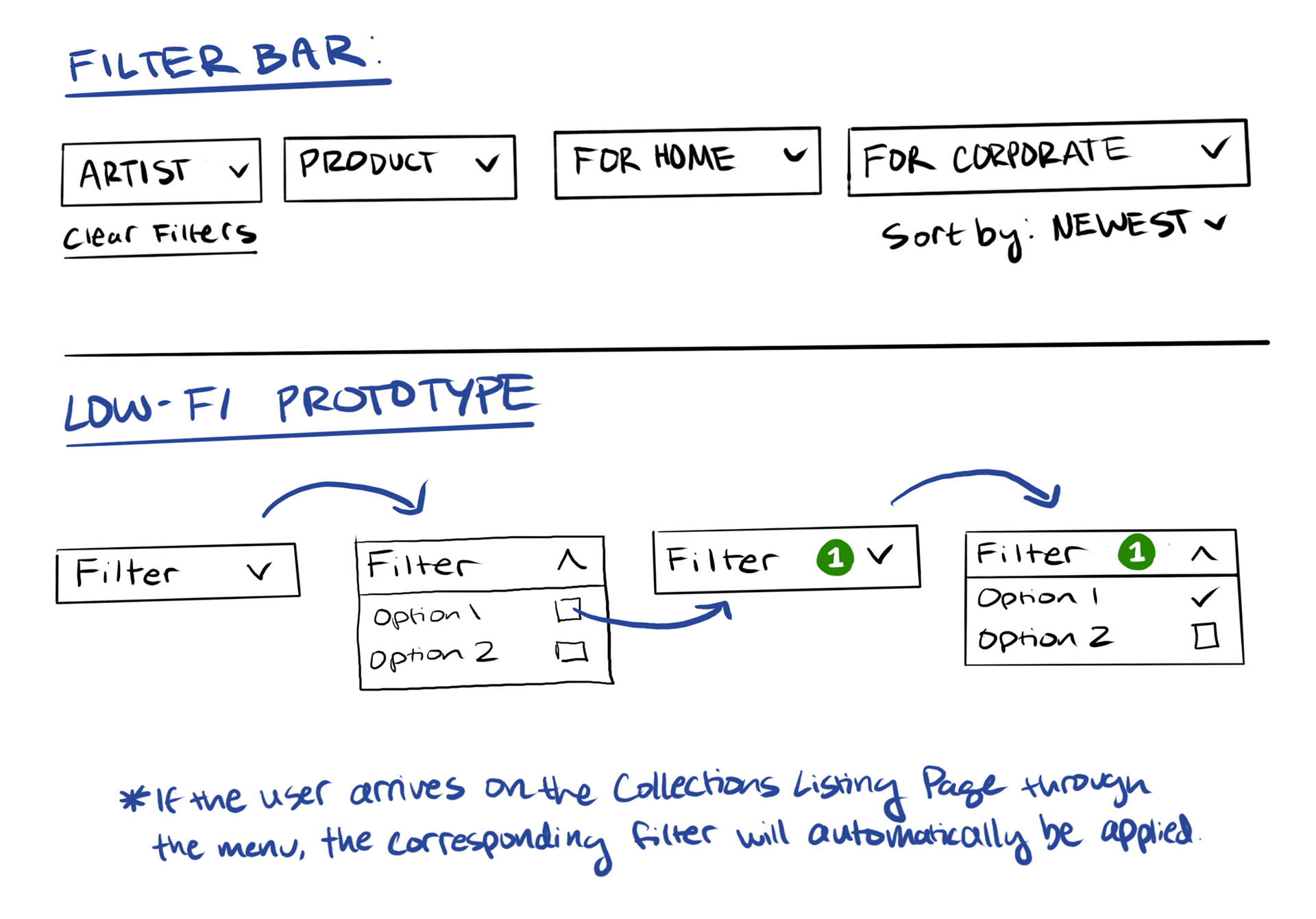
I strived to keep the filter bar design simple, considering the multitude of products and categories. The filter bar features minimalistic dropdowns for different Collection categories, along with two additional support options: 'Clear Filters' and 'Sort By.'
As I wanted to show that filters were instantly applied based on the user's selection from the Collections menu, I highlighted this with a colorful filter indicator. This ensures users can easily discern and manage the displayed results, without navigating through individual product category landing pages.
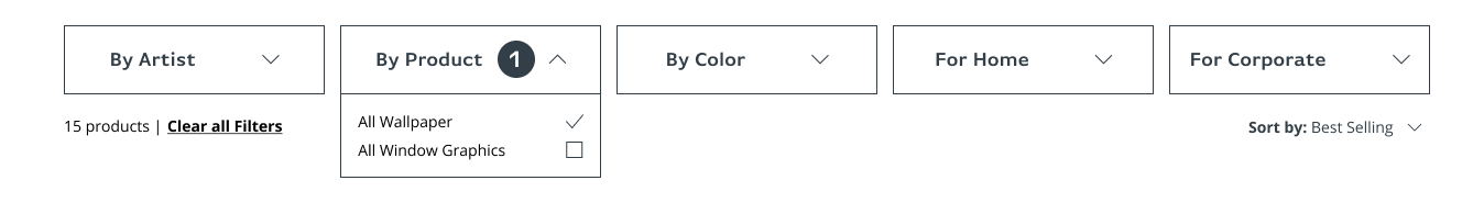
Revisions:
While working on the design, my stakeholders asked if we should include a "By Color" filtering option as they saw it was common among our competitors.
While considering that too many filtering options could lead to cognitive overload, I ultimately agreed this would be a beneficial choice. We saw many of our competitor's search acquisitions included a specific color, so it was likely to be beneficial to our users. Plus, this filtering option makes it easier for users to customize their experience based on their preferences. I added this to the filtering options and sitemap.
Collections Product Detail Page
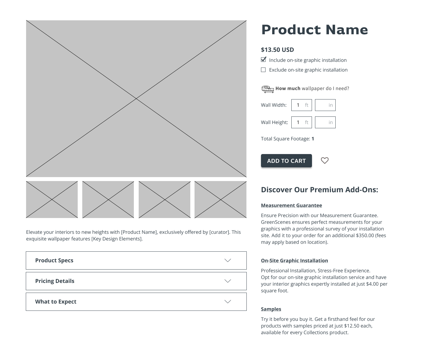
The Collections Product page had ample information for users to understand and interact with, such as the variable pricing (based on quantity and services included), custom dimensions input, optional services, product specs, and explaining what customer-company interaction is required after placing the order.
Through multiple sketches, I brainstormed different ways to organize the information hierarchically and visually.

I started by designing the concrete UI components that the user would need to interact with. Through iterations, I worked to streamline information and make the essential ordering information as intuitive and clear as possible. This encompassed:
- Price is automatically calculated by the user's input dimensions (ie. $X.XX for Y square feet)
- Allowing users to input the exact amount the material they need based on their custom dimensions, rather than ordering rolls of material. This supports users in ordering the perfect amount of material.
- Installation services seamlessly integrated below the price as an optional checkbox, ensuring visual clarity. While this checkbox is automatically selected and factored into the pricing, I focused on enhancing the visual hierarchy to ensure that users can easily comprehend its inclusion.
- Placing the favorite option next to the "Add to Cart" button, gives users the choice to either purchase now or save for later.

Collections Product Detail Page - Sketching
Collections Product Detail Page - Lo-Fi Wireframe
Next, I worked to incorporate other pertinent information such as optional services, product information, specs, and information on what customer-company interaction is required after placing the order.
After several iterations, I implemented the following strategies:
Premium Add-Ons Section: I listed and provided brief explanations for all supplementary services beneath the "Add to Cart" button, ensuring that users could easily discover and learn more about additional services in one accessible place. I included links to their landing pages for users to learn more and seamlessly add them to the cart.
Site Survey Popup: Given the decision to introduce a Site Survey pop-up when users input their product quantity (determined when setting KPIs in the Content Strategy phase), I opted to exclude it from the automatic pricing checkboxes. This decision was made to prevent potential user hesitation caused by an immediate $350 surcharge, allowing users to understand the additional cost before committing.
Drop-Down Boxes: For product specs, pricing details, and expectations, I organized the information within collapsible drop-down boxes. This design ensures that the information is readily available but remains accessible on the user's terms, promoting a user-friendly experience.
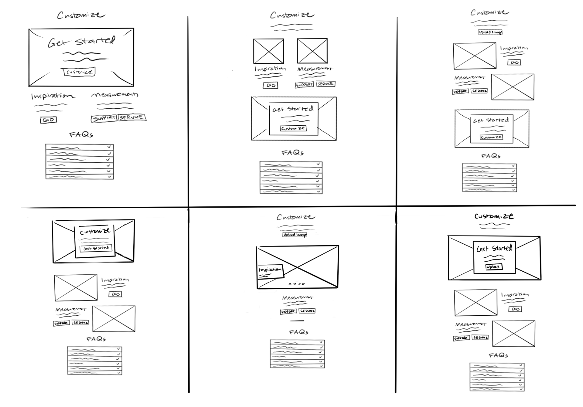
Customize Landing Page
Since the Customize flow was based on users uploading their own artwork rather than picking from existing products, it required a different starting point compared to Collections. So, instead of taking users directly to the upload process, I created an informative landing page that would explain what customization is and guide users to the upload process.
Customize Landing Page - Sketching
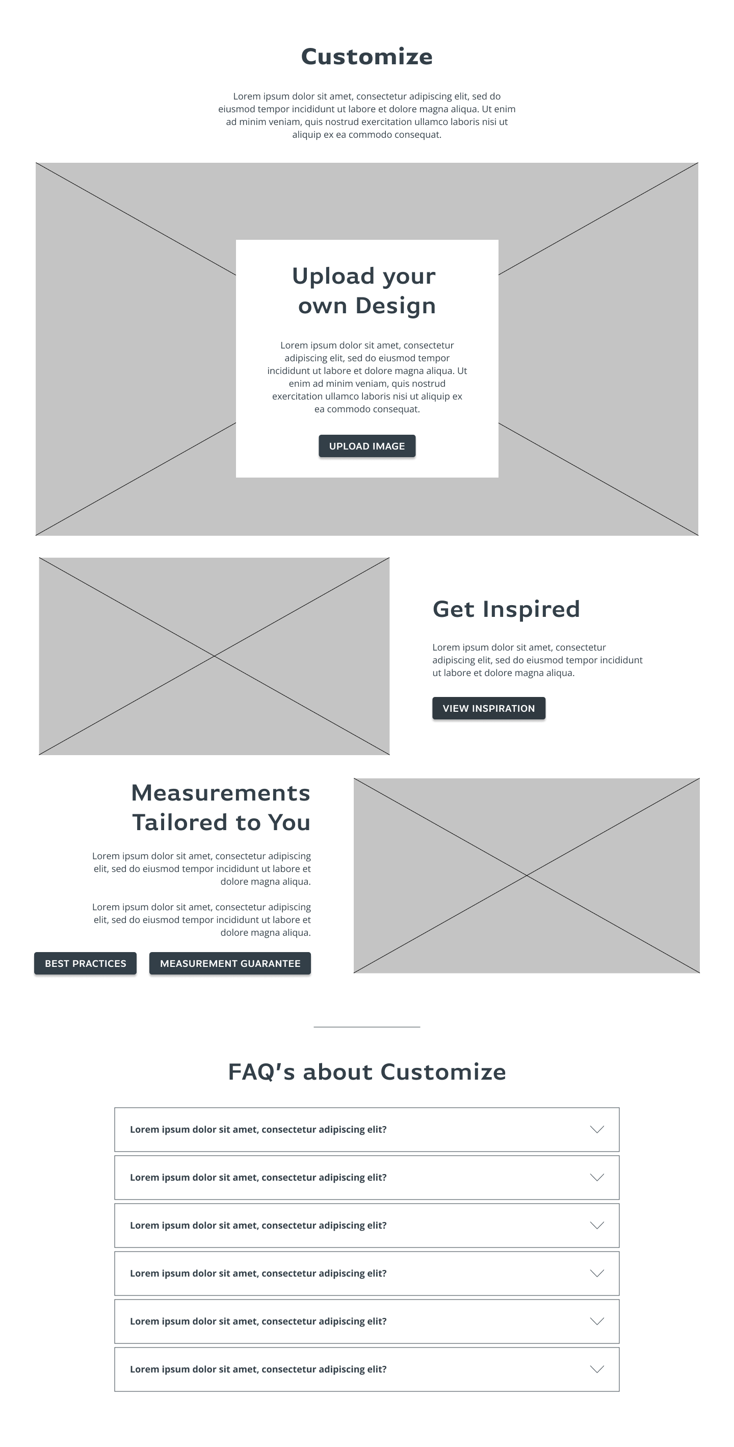
Customize Landing Page - Lo-Fi Wireframe
The content blocks I was working with included a clear CTA to start the customizing process, provide inspiration information, measurement support, and answer Customization FAQs.
I brainstormed different layouts, ultimately deciding on the layout that primarily highlighted the Customize CTA as a hero image while incorporating imagery into the supportive elements.
About Pages (Template)
Inspired by the Customize landing page, I built out a template for all of the additional informational pages that fall under the 'About' section of the site.

About Pages (Template) - Sketching
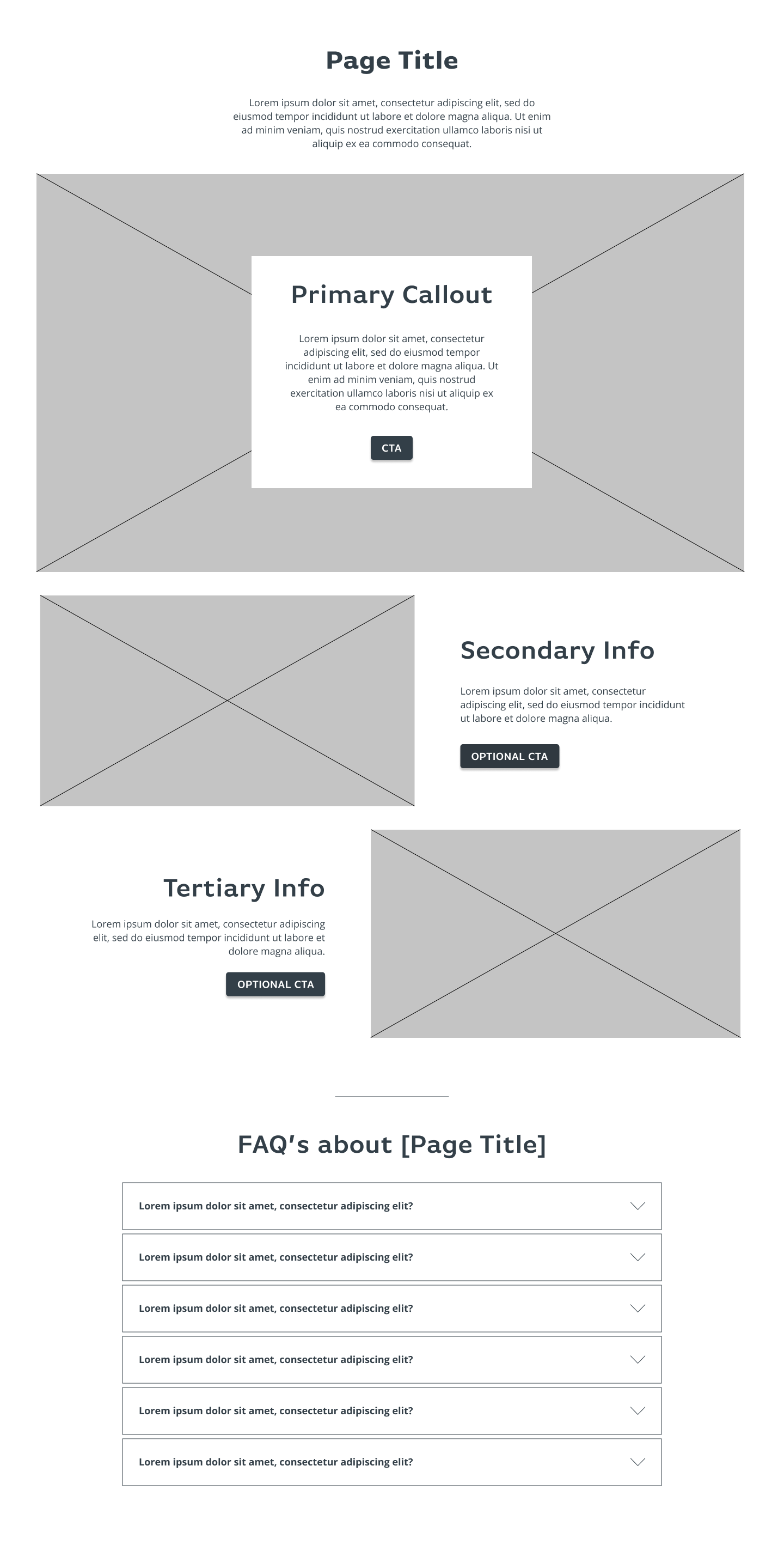
About Pages (Template) - Lo-FI Wireframe
This layout uses hierarchy and contrast in size to funnel information from most pertinent to least pertinent to the user's understanding. Plus, it fits well into my content strategy of having three pieces of information for each page, while allowing for flexibility with the supplementary info sections and CTAs.
Header and Footer
Next, I arranged the pages from the informational architecture to design the header and footer. To ensure the design was effective across different screen resolutions, I built both desktop and mobile versions.
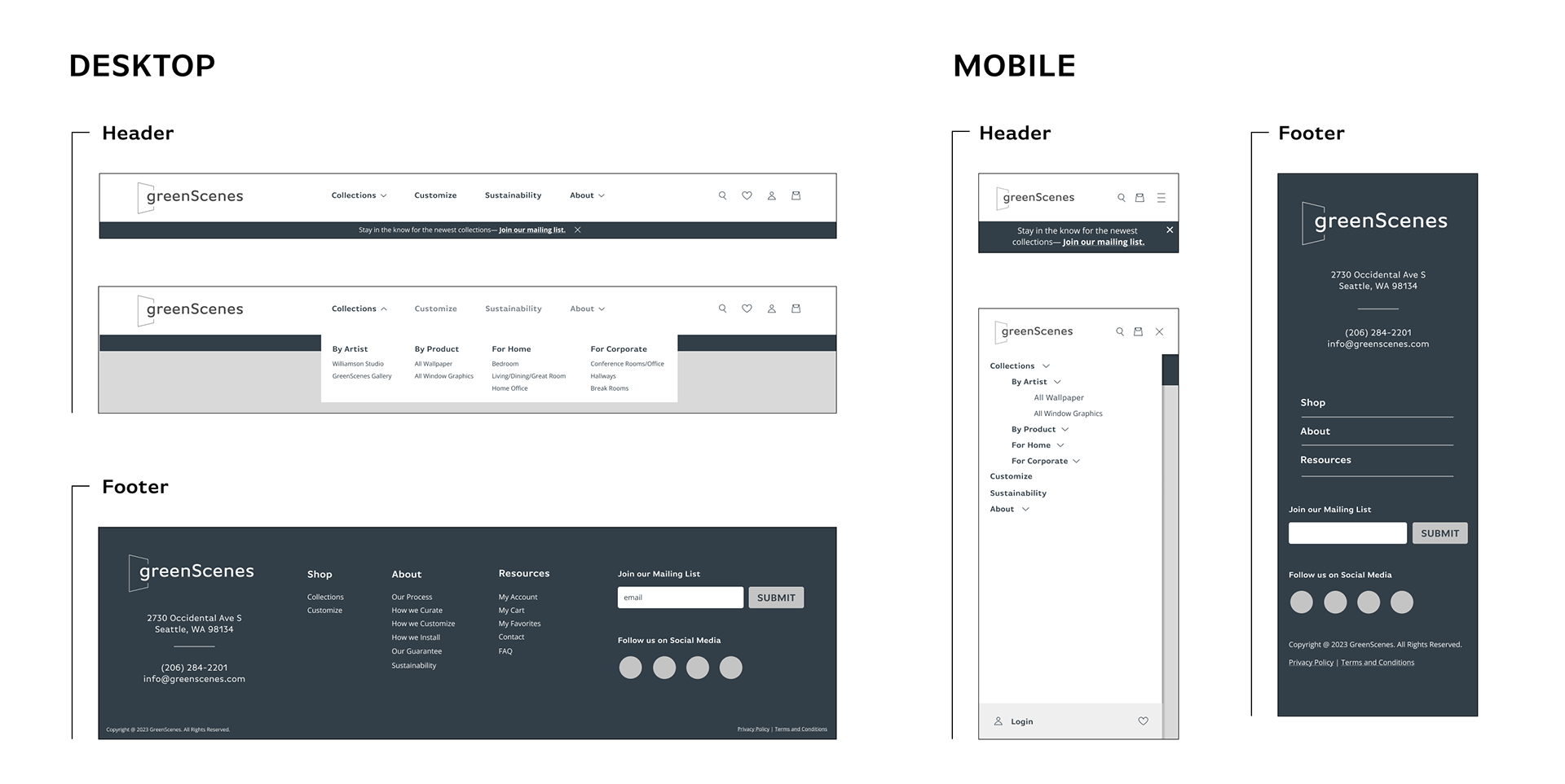
As the site was being built on Shopify, I collaborated with the developer to align the design with Shopify's inherent features and UI components. This involved adopting specific iconography for search, favoriting, and user accounts, along with implementing the hamburger menu for mobile resolutions.
As outlined in the Content Strategy section, one of GreenScenes' KPIs was subscription acquisition. To target this, I designed a minimalistic form in the footer and a fixed notification bar below the header navigation.
Wireframing
Guided by my user journey map, sketches, and low-fidelity wireframes, I built wireframes for the two key flows: Collections and Customize. This was essential to me in determining the overall structure and flow of the user experience. Plus, these low-fidelity wireframes provide a tangible representation of the design concept, making it easier for my stakeholders to understand and provide feedback.
During this phase, I intentionally crafted wireframes for both desktop and mobile versions to ensure adaptability across various resolutions. This approach also provided the developer with concrete designs to assess feasibility and identify potential modifications.
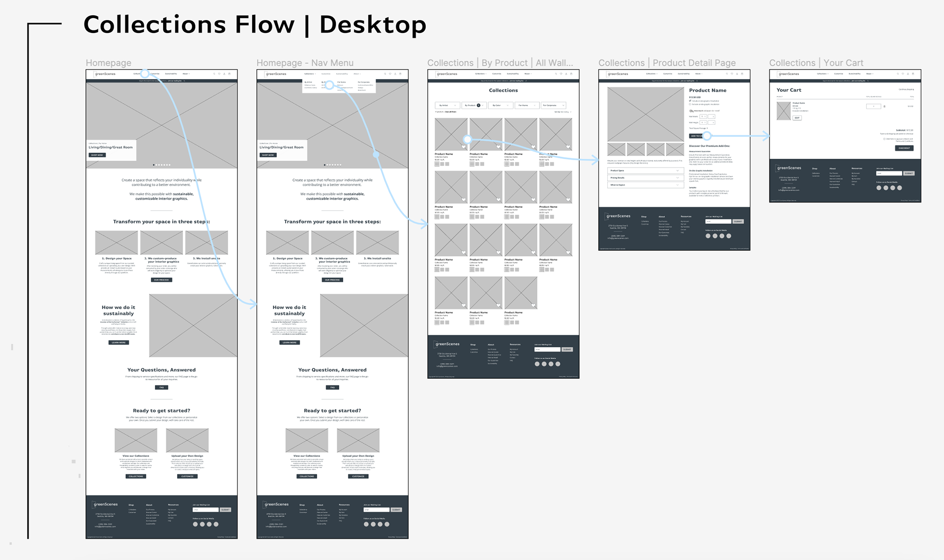
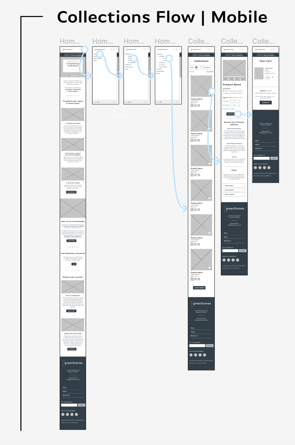
Collections Flow
With this wireframe, I connected the pages from the Collections User Journey Map: Homepage, Product Listing page, Product Detail page, and Cart.
I ultimately aimed to keep this flow as streamlined as possible, achieving this through a simplified navigation menu, efficient product filtering, and an organized product detail page.
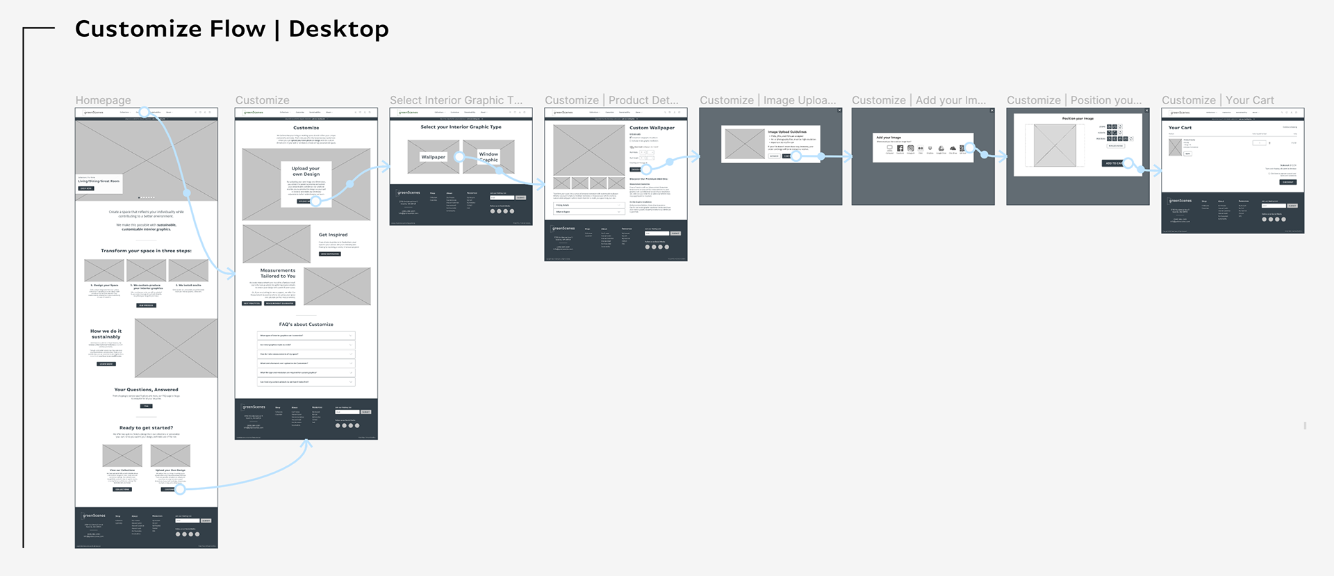
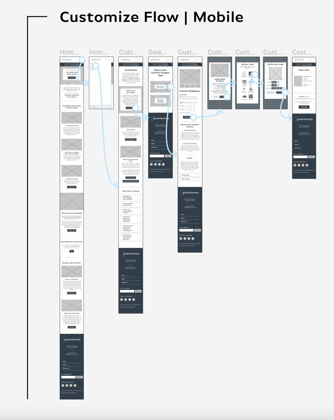
Customize Flow
This flow involves more information for users to comprehend and provide themselves, resulting in more steps for the user to work through. However, my primary goal remained to design each page to be as intuitive and digestible as possible.
In creating this flow, I connected the Homepage, Customize landing page, Select your Interior Graphic Type page, Customize Product Detail page, Image Upload Guidelines, Image Upload, Customizer Tool, and Cart.
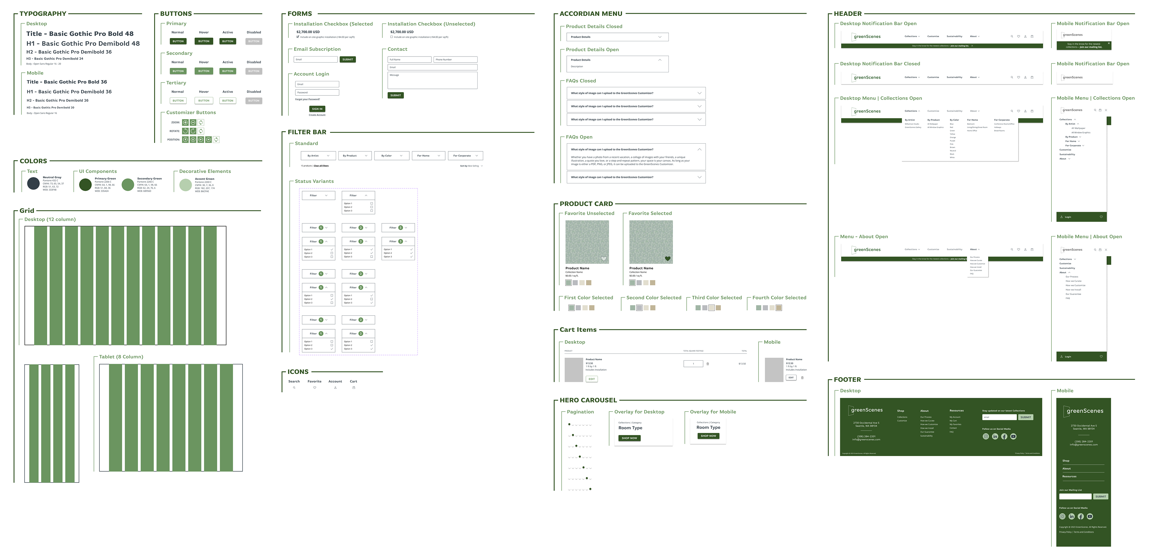
UI Component Library
Utilizing my brand guidelines, I created a component library to share with the developers. This provides them with a centralized resource to refer to GreenScenes' visual standards and seamlessly incorporate relevant components.
More Coming Soon!
I am currently in the process of completing this case study and look forward to sharing prototypes, testing, results, and reflections with you soon. I appreciate your patience in the meantime. Stay tuned!